How to Use SnipCSS
Steps to Create a Snippet
- After installing the extension, click on the SnipCSS extension icon in your browser. (it may be hidden in puzzle icon if not pinned)
- Select the target element or section on the webpage.
- Press the Run SnipCSS button to extract the associated HTML, CSS, and assets of that element, only extracting the related styles.
Tips for Best Results
- Include Same Dimensions Parent Conainer: Use the "Select Parent" button after selecting to ensure you are including the largest container that only includes that element.
- Watch number of Elements: Look at the number of selected elements in the floating panel, if it's over 800 elements it's probably too big of a snippet to be a reusable component
- Customize with Options: Turn on Tailwind in the Options page. When Tailwind is checked the primary output in the preview page will be the Tailwind output.
SnipCSS Options Page
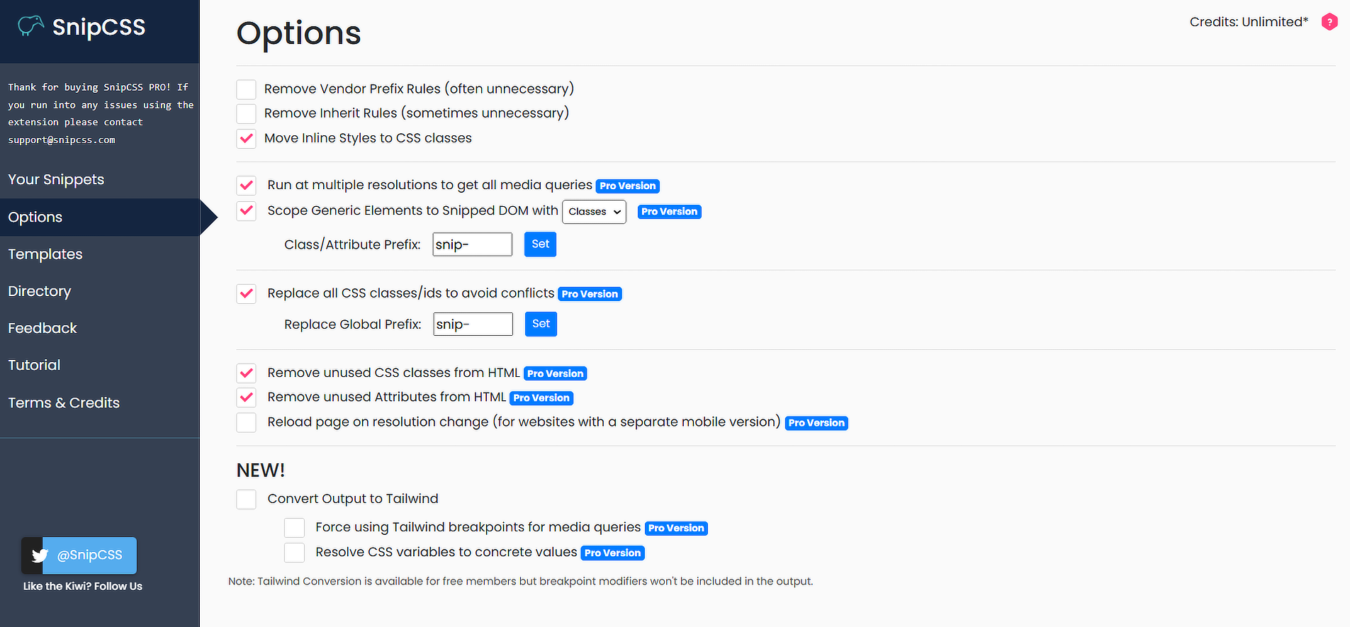
To get to the Options Page, right-click the extension icon (sometimes hidden in puzzle piece) and select "Extension Options".
General settings
- Remove Vendor Prefix Rules
- Removes vendor-specific prefixes (e.g., -webkit-, -moz-) from CSS properties.
- Remove Inherit Rules
- Omits inherited CSS properties that are often unnecessary.
- Move Inline Styles to CSS Classes
- Converts inline styles into reusable CSS classes.
Pro version settings
- Run at Multiple Resolutions
- Extracts all media queries by analyzing the website at different screen sizes.
- Scope Generic Elements to Snipped DOM
- Allows scoping of generic elements using either classes or data attributes.
- Class/Attribute Prefix (Input Box): Define a custom prefix for scoped classes or attributes (default: snip).
- Replace All CSS Classes/IDs to Avoid Conflicts
- Ensures all extracted classes/IDs are uniquely named.
- Global Prefix (Input Box): Set a global prefix for classes/IDs (default: snip).
- Remove Unused CSS Classes
- Strips unnecessary classes from the extracted HTML.
- Remove Unused Attributes
- Removes unused attributes to declutter the extracted HTML.
- Reload Page on Resolution Change
- Reloads the page during resolution changes which can capture desktop-only/mobile-only CSS (most sites do not load/exclude stylesheets based on device, but this feature was made for those that do)
- Convert Output to Tailwind
Converts extracted CSS to Tailwind classes.
- Force Using Tailwind Breakpoints for Media Queries - will try to use the closest appropriate tailwind breakpoint instead of custom ones defined in the page
- Resolve CSS Variables to Concrete Values - Recursively resolves variables to get their value before applying the tailwind class with that value